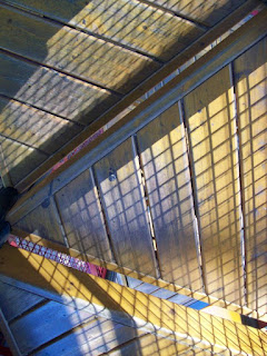
The physical environment of a park is important because visitors approach certain pieces based on how they look. The photos and illustrated map give you an idea of the unconventional shapes and forms present. Structures are multidimensional and unleveled. I can only describe it as an organized place of chaos. This is a place to expect the unexpected!
Color choice matters. An all-pink park would repel older boys. Can you imagine toddlers running towards the whites, beiges, and grays? Notice the primary and and secondary colors used throughout the location. Each piece draws the attention of children, as if beckoning, "come play!"
 |
| Climbing structure made of metal and rope |
 At a closer glance, different types of surfaces are seen above, below, and everything in between. The ground is covered with mulch that shifts around or recycled rubber with a slight bounce to it. Metal pieces are shiny and smooth while the wooden steps have been worn down from use. Textiles were used to "weave" the spider web and cover the tent.
  The purpose in coming to a park is to experience movement different from routinal ranges of motion. The physical environment of this place is visibly noticed and tangible. When having a good time here, your two feet should not be on solid ground. This place causes you to climb, spin, swing, and leap in all directions.
  |
| You see that it's blue and then feel it move. |


Diana, I LOVE the map! It's great!
ReplyDeleteI had never really thought about the color choices at the park before even though I've been to all the parks in town. There are several that are drab colors and I realized that we avoid those. Such an interesting point.
Diana - I agree with Patti. Your map is AWESOME!! I really loved, both in our discussion at the park and as written in the blog, your observations about movement outside our normal patterns being essential in indicating "playtime". I'd never thought of how a park causes you to be outside your day to day box of behavior - walk don't run, sit up straight, keep two feet on the ground - and to instead see instability as an invitation to move, act and perhaps think differently. Very insightful!
ReplyDeleteAgreed -- great map! The pictures are very engaging as well. I'm interested to hear your thoughts -- did you think there anything you noticed in the park that was especially designed to be appealing to adults?
ReplyDeleteGreat post :)
I love your descriptions of the park. The pictures truly give your subject matter meaning! I feel like I was there...Oh wait, I was! :o)
ReplyDeleteIn response to Arthur's question,
ReplyDeleteI think the wooden platfrom that connected to the biggest structure was for "bigger" people to check on their kids. The swings were placed away from the structure for adults to sit on while watching their children on the sets. The mosaic with the quote was for the adults' benefit. I don't think 7-year-olds would quite appreciate the meaning yet.
I don't think anything fun was intentionally built for adults and even if there was, it'd probably be only used by the kids.
Great insights! Many people don't realize that we read colors, shapes, and textures in ways that shape meanings as powerfully as print.
ReplyDeleteI agree with your diagnosis of the colors, but I grew up when playgrounds were largely brown and gray and we still rushed to the equipment like mad people. I wonder if kids "read" the colors because we have conditioned them to do so or is it something innate?
ReplyDeleteI think it is a natural part of us to like colors. People are drawn to certain things based on how they look. It's just that back then, there weren't many choices to choose from so kids were only attracted to what they knew.
ReplyDeletePlaces that charge kids to play (Chuck E Cheese's) use color in their equipment as enticement. When plastic and textiles started to replace wood and rusty metal, we got excited because the new sets looked like an amusement park!